> ## Documentation Index
> Fetch the complete documentation index at: https://docs.thesys.dev/llms.txt
> Use this file to discover all available pages before exploring further.
# API Changelog
> View changelogs for each API version of C1.
Embed model versions:
* `c1///v-20260331`
For example, `c1/anthropic/claude-sonnet-4.6/v-20260331`
Minimum SDK version:
* @thesysai/genui-sdk: `0.9.0`
* @crayonai/react-ui: `0.9.16`
* @crayonai/react-core: `0.7.7`
Upgrading to `v-20260331` is a **backwards incompatible** change due to a new OpenUI response format and component-level changes.
**Existing threads are not affected.** Threads started on `v-20251230` or earlier will continue to function on those versions even if you change the model. The new API version is automatically routed to `v-20251230` for old threads. OpenUI responses are only supported for new threads created with `v-20260331` or later.
## OpenUI Support
C1 now supports the [OpenUI Framework](https://www.openui.com/) - upto 3x faster generations compared to the JSON implementation, with upto 66% less token consumption.
## New Components
This release brings in a whole set of new components. The entire library has also ben shifted to OpenUI CSS from Crayon CSS.
A full list of all the new components and changes will be documented soon, with guides on CSS migration and generation prompts.
## Custom Component Migration
The custom component declaration, schema declaration, and passing to the API stays the same. The only change is an additional step of passing the
component schema to the GenUI SDK. Basing the instructions off the [existing guide](/guides/custom-components), the change is as follows:
### `v-20260331` version onwards
Previous version [here](/guides/custom-components). Steps 1, 2, 3 stay the same.
`zod` moves from version `3` to version `4`, i.e. `zodToJsonSchema` is now `z.toJSONSchema`.
```ts src/app/api/chat/route.tsx theme={null}
const CUSTOM_COMPONENT_SCHEMAS = {
FlightList: zodToJsonSchema(FlightListSchema), // [!code --]
FlightList: z.toJSONSchema(FlightListSchema), // [!code ++]
};
```
```ts src/app/page.tsx theme={null}
import { C1Chat } from "@thesysai/genui-sdk";
import { FlightList } from "./components";
// ...
export default function Home() {
return (
);
}
```
Artifact model version:
* `c1/artifact/v-20260130`
Minimum SDK version:
* @thesysai/genui-sdk: `0.8.3`
* @crayonai/react-ui: `0.9.16`
## New Features
* **Welcome Screen** - The `C1Chat` component now supports a configurable welcome screen displayed when a thread is empty. You can customize the title, description, and image to greet users when they start a new conversation. See the [`welcomeMessage` prop](/react-reference/c1-chat#props) for details.
* **Conversation Starters** - The `C1Chat` component now supports conversation starters — clickable prompt buttons shown on the welcome screen to help users quickly begin a conversation with predefined options. Supports both `short` (pill) and `long` (list) variants. See the [`conversationStarters` prop](/react-reference/c1-chat#props) for details.
* **Artifact Editing** - Users can now edit artifacts inline directly within the chat interface, enabling a more interactive workflow. For setup instructions, see [Editing Artifacts](/guides/artifacts/editing).
* **Pinch Zoom in Reports** - Reports now support pinch-to-zoom functionality, making it easier to inspect details in generated reports.
* **New Slide Templates** - Added new slide templates, giving more design options for generated slide presentations. See the full [Slide Templates (v-20260130)](/guides/artifacts/slides/slide-templates/v-20260130) reference for all available templates and parameters.
* **PPTX Export for Slides** - Slide artifacts can now be exported as `.pptx` files, enabling seamless use in PowerPoint and other presentation tools. See the [Exporting Slides to PPTX](/guides/artifacts/pptx-export) guide for setup instructions.
* **New Report Blocks** - Added new block types for reports, expanding the variety of content that can be generated within report artifacts.
Stable embed model versions:
* `c1/anthropic/claude-sonnet-4/v-20251230`
* `c1/openai/gpt-5.2/v-20251230`
* `c1/openai/gpt-5/v-20251230`
Experimental embed model versions:
* `c1-exp/anthropic/claude-sonnet-4.5/v-20251230`
* `c1-exp/anthropic/claude-haiku-4.5/v-20251230`
Visualise model version:
* `c1/anthropic/claude-sonnet-4/v-20251230`
Artifact model version:
* `c1/artifact/v-20251230`
Minimum SDK version:
* @crayonai/react-ui: `0.9.9`
* @thesysai/genui-sdk: `0.7.15`
## New Model Support
C1 now supports `Claude Sonnet 4.5` and `Claude Haiku 4.5` models. These are enabled via the C1 API as **experimental** models. Production use of these models is not encouraged.
## New Features
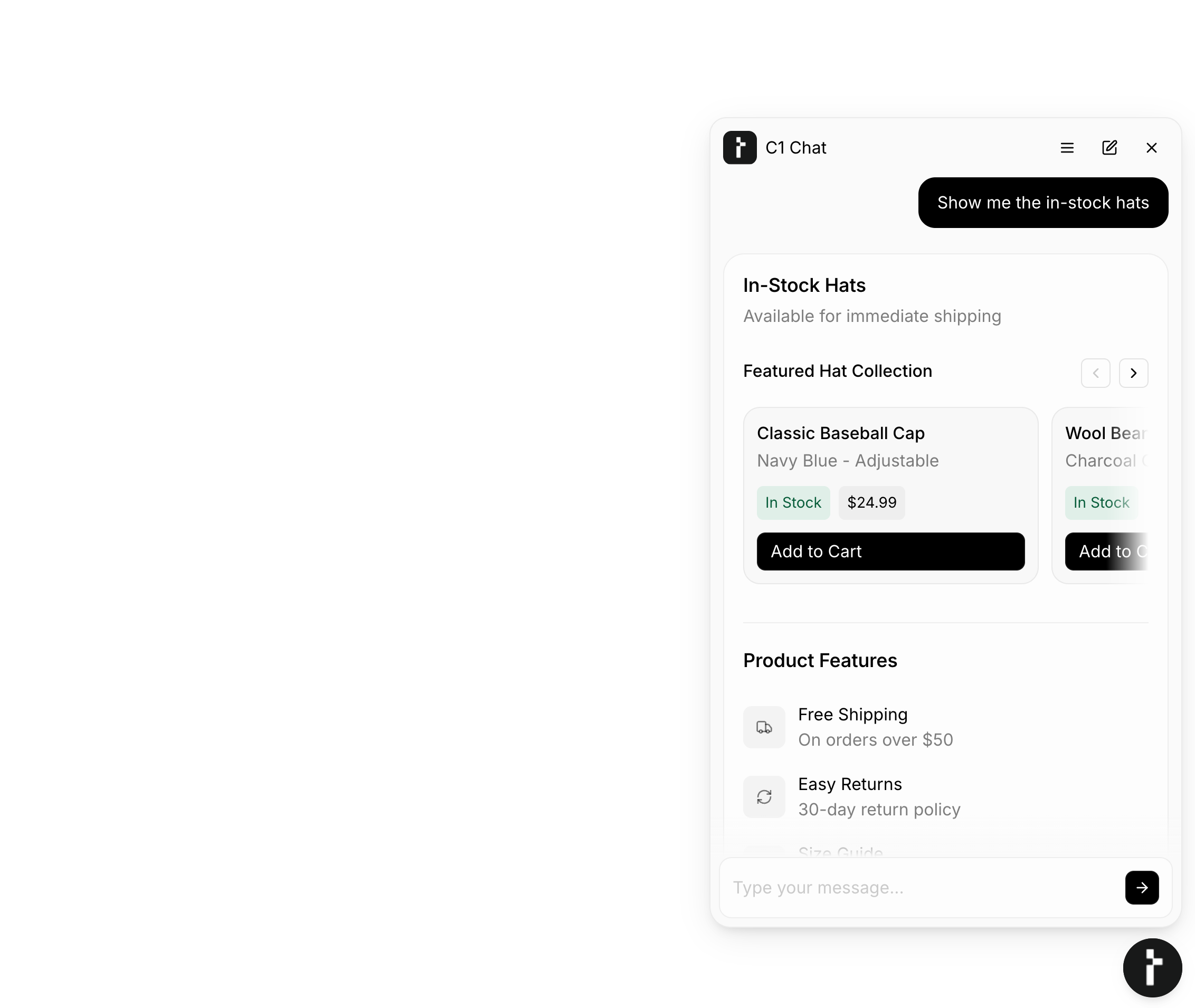
* **Tray Widget Form Factor** - The `C1Chat` component now supports a new `bottom-tray` form factor for tray widget layouts. This enables a variety of use cases, including widget-based chatbot interactions and minimizable chat interfaces.
* **Mermaid Diagram Generation** - C1 now supports generating mermaid diagrams. This is **not** enabled by default. To use mermaid generation, users should enter a supporting system prompt:
```
You can generate mermaid diagram code in TextContent.
```
* **Enhanced Components**
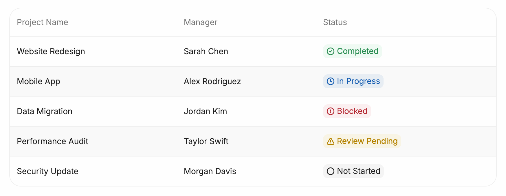
* **Tag variants** - C1 tags now support standard color variants: `neutral`, `info`, `success`, `warning`, `danger`. These variants can be used to suppliment semantic information with colors, and can optionally be guided via system prompts.
* **Image improvements** - We improved the way images are displayed, especially in wide layouts. This ensures all images are rendered with balanced aspect ratios.
* **C1 Artifact icon generation** - We have significantly improved our icon generation process. Embed models already support this, and support has been extended to the C1 Artifact model as well.
Model versions:
* `c1/anthropic/claude-sonnet-4/v-20251130`
* `c1/openai/gpt-5/v-20251130`
Minimum SDK version:
* @crayonai/react-ui: `0.9.6`
* @thesysai/genui-sdk: `0.7.5`
## New Features
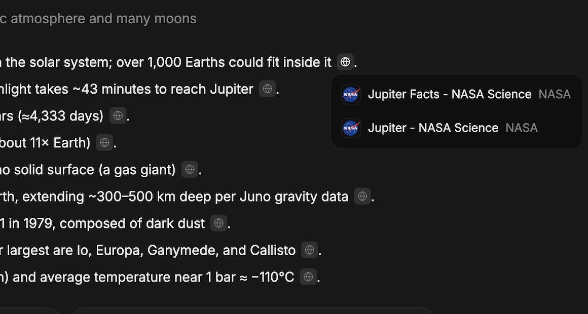
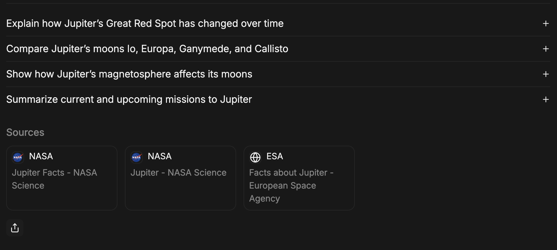
* **Citations and Source Links** - C1 can now include citations and links to the original sources for the facts and data it presents. This adds credibility to the data and allows the user to verify the information.
* **Enhanced Interactivity**
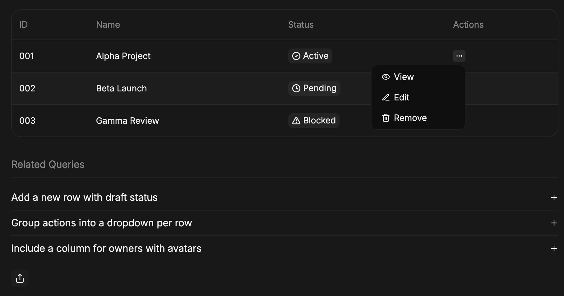
* **Action Column for Tables** - C1 can now generate a dedicated action column in tables, with buttons and actions that are specific to each row. This makes it easier than ever for users to act on data directly where they see it, from viewing details to deleting an entry.
* **Expanded Support for Actions** - C1 can now attach continue conversation, custom actions and open\_url actions to Icon Buttons and List Items. This provides more design flexibility to place actions in more intuitive, contextual locations within your UI.
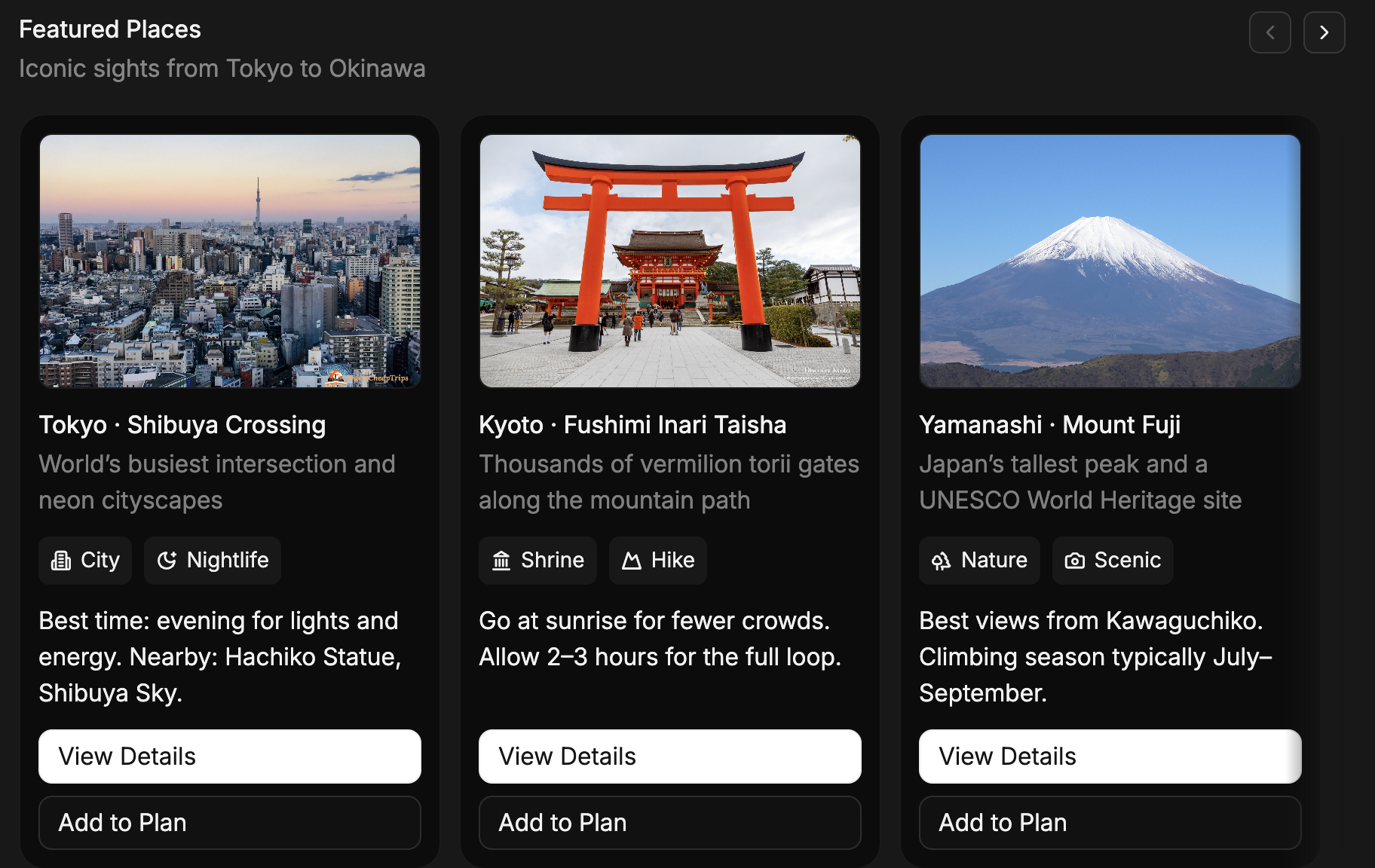
* **Carousel Footer for Actions** - Carousel items can now have a footer for action buttons. The buttons are aligned across the bottom of the carousel item.
* **'Explore' Button** - C1 can now add an optional "explore" button next to choices in checkboxes, radio groups, and switches. This allows a user to click for more information about a specific option, perfect for complex forms or when choices require more explanation.
Not included by default, but can be added by using the `c1_included_components` metadata.
```ts theme={null}
const runToolResponse = openAIClient.chat.completions.runTools({
// ... other options
metadata: {
thesys: JSON.stringify({
c1_included_components: ["ExploreButton"],
}),
},
});
```
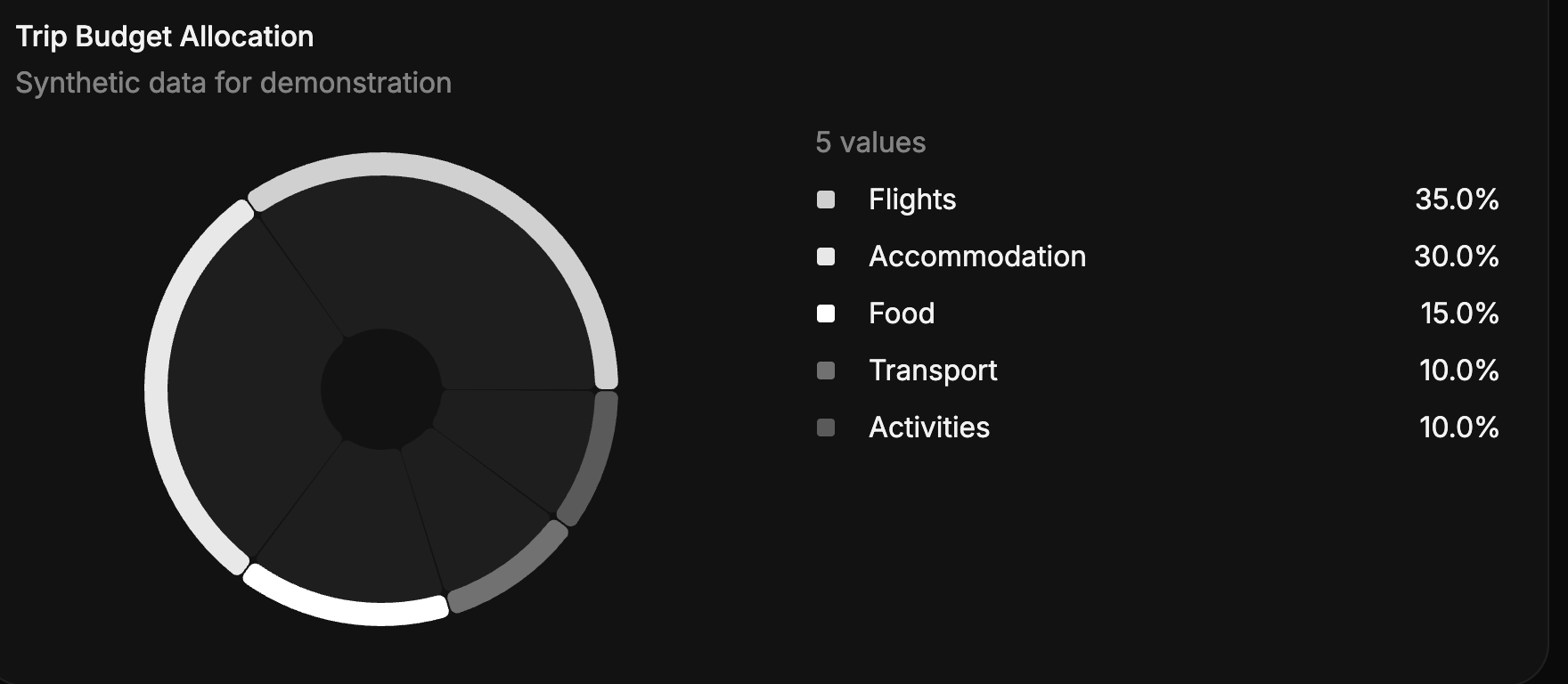
* **New Chart Type: Donut Chart** - We have added Donut Chart to the library of charts in C1. This is a variant of the Pie Chart that is displayed as a donut shape.
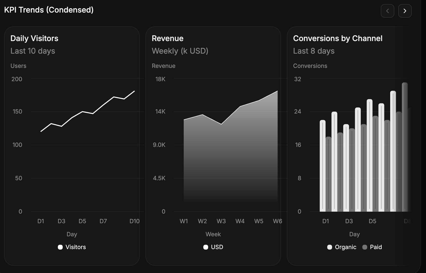
* **New: Condensed Charts** - Perfect for dashboards and tight spaces, C1 can now generate condensed versions of Bar, Area, and Line charts. These minimalist charts are designed to convey trends and data at a glance without taking up too much screen real estate.
* **Smarter Icon Generation** : We've significantly improved our icon generation logic to be more reliable. This fix completely eliminates cases of missing icons in the UI.
Model versions:
* `c1/anthropic/claude-sonnet-4/v-20250930`
* `c1/openai/gpt-5/v-20250930`
Minimum SDK version:
* @crayonai/react-ui: `0.8.41`
* @thesysai/genui-sdk: `0.6.40`
## New Features
* **Custom Actions** - We now allow C1 users to define custom actions that can be triggered from the C1 UI.
For more details and examples, refer to [Custom Actions](/guides/custom-actions).
* **New Components** - We have added the following new components:
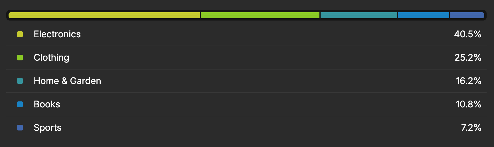
* **Single stacked bar chart** - A horizontal bar chart that represents a whole divided into proportional segments. Each segment (or “slice”) corresponds to a specific category and visually depicts its percentage contribution to the total.
 * **Scatter chart** - A chart that plots data points to show the relationship between two variables. It helps identify trends, correlations, and outliers in the data.
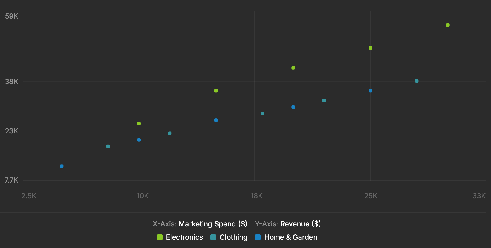 * **Redesigned Component** - We have redesigned the Carousel, Table and Slider components to be more responsive and user-friendly.
Model versions:
* `c1/anthropic/claude-sonnet-4/v-20250915`
* `c1/openai/gpt-5/v-20250915`
Minimum SDK version:
* @crayonai/react-ui: `0.8.31`
* @thesysai/genui-sdk: `0.6.34`
## New Features
* **Bring Your Own Components** - We now allow C1 users to provide their own custom React components for generation as a part of the C1 API and GenUI SDK.
For more details and examples, refer to [Custom Components](/guides/custom-components).
* **New Stable Models** - With `v-20250915` we are introducing GPT-5 as a stable offering.
Older model strings for GPT-5 experimental (`c1-exp/openai/gpt-5/`) will no longer be maintained, and all new features and bug fixes will now be released for the stable versions.
* **Foldable Sections** - We updated our sections to now allow foldable sections. The C1 API decides whether to use foldable sections or not at runtime based on the content and length of the section.
* **Redesigned Component** - We have redesigned the Carousel, Table and Slider components to be more responsive and user-friendly.
Model versions:
* `c1/anthropic/claude-sonnet-4/v-20250915`
* `c1/openai/gpt-5/v-20250915`
Minimum SDK version:
* @crayonai/react-ui: `0.8.31`
* @thesysai/genui-sdk: `0.6.34`
## New Features
* **Bring Your Own Components** - We now allow C1 users to provide their own custom React components for generation as a part of the C1 API and GenUI SDK.
For more details and examples, refer to [Custom Components](/guides/custom-components).
* **New Stable Models** - With `v-20250915` we are introducing GPT-5 as a stable offering.
Older model strings for GPT-5 experimental (`c1-exp/openai/gpt-5/`) will no longer be maintained, and all new features and bug fixes will now be released for the stable versions.
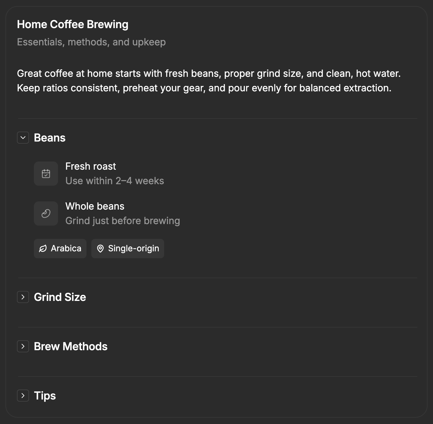
* **Foldable Sections** - We updated our sections to now allow foldable sections. The C1 API decides whether to use foldable sections or not at runtime based on the content and length of the section.
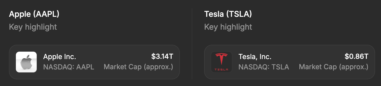
 * **Inline Headers** - Components now have an optional inline header, allowing for more context to be given with the response.
 ## Bug Fixes / Improvements
* Form inputs are now disabled until the assistant response is fully generated.
* Improved component usage of `c1/anthropic/claude-sonnet-4/v-20250915` and `c1/openai/gpt-5/v-20250915`
* Improved internal error handling of the C1 API
Model versions:
* `c1/anthropic/claude-sonnet-4/v-20250831`
* `c1-exp/openai/gpt-5/v-20250831`
Minimum SDK version:
* @crayonai/react-ui:"0.8.27"
* @thesysai/genui-sdk: "0.6.32"
## New Features
* **Editable Table** - Added support for an inline multi edit component that allows changing multiple records at once.
Not included by default, but can be added by using the `c1_included_components` metadata.
## Bug Fixes / Improvements
* Form inputs are now disabled until the assistant response is fully generated.
* Improved component usage of `c1/anthropic/claude-sonnet-4/v-20250915` and `c1/openai/gpt-5/v-20250915`
* Improved internal error handling of the C1 API
Model versions:
* `c1/anthropic/claude-sonnet-4/v-20250831`
* `c1-exp/openai/gpt-5/v-20250831`
Minimum SDK version:
* @crayonai/react-ui:"0.8.27"
* @thesysai/genui-sdk: "0.6.32"
## New Features
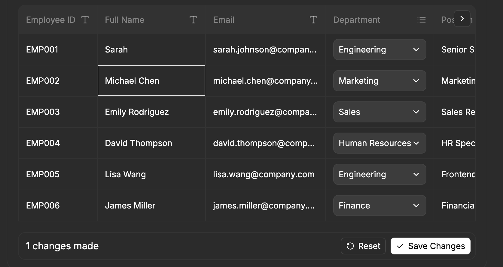
* **Editable Table** - Added support for an inline multi edit component that allows changing multiple records at once.
Not included by default, but can be added by using the `c1_included_components` metadata.
 ```ts {3-6} [expandable] theme={null}
const runToolResponse = openAIClient.chat.completions.runTools({
// ... other options
metadata: {
thesys: JSON.stringify({
c1_included_components: ["EditableTable"],
}),
},
});
```
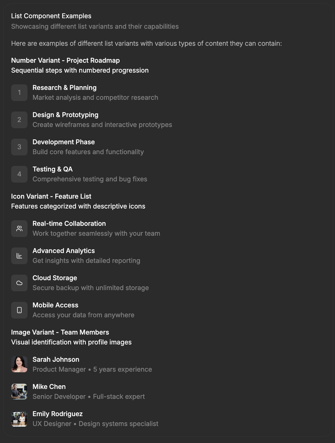
* **Improved List** - We refined the list component by removing unclear interactive behavior, improving
visual clarity, and adding support for multiple types: images, icons, and numbers.
```ts {3-6} [expandable] theme={null}
const runToolResponse = openAIClient.chat.completions.runTools({
// ... other options
metadata: {
thesys: JSON.stringify({
c1_included_components: ["EditableTable"],
}),
},
});
```
* **Improved List** - We refined the list component by removing unclear interactive behavior, improving
visual clarity, and adding support for multiple types: images, icons, and numbers.
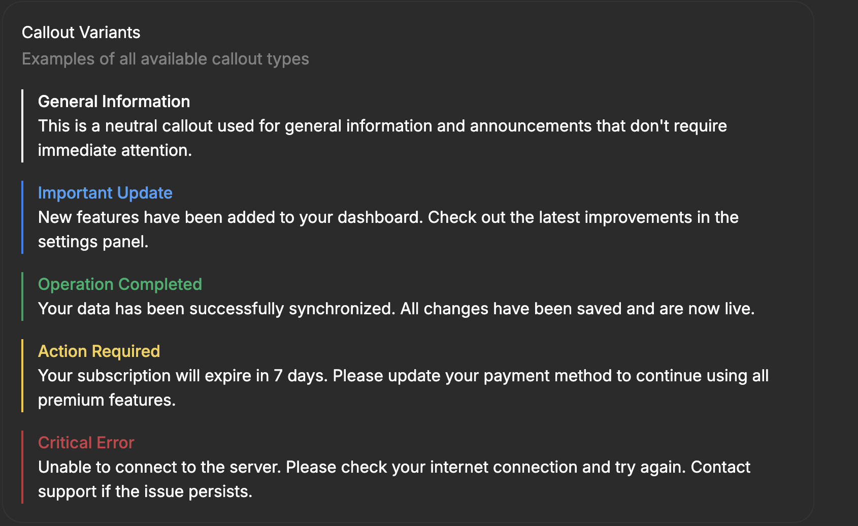
 * **Improved Callout** - We updated the callout visually to feel more contextual and natural specifically
within conversation-based interfaces, improving clarity and highlighting key information more effectively.
* **Improved Callout** - We updated the callout visually to feel more contextual and natural specifically
within conversation-based interfaces, improving clarity and highlighting key information more effectively.
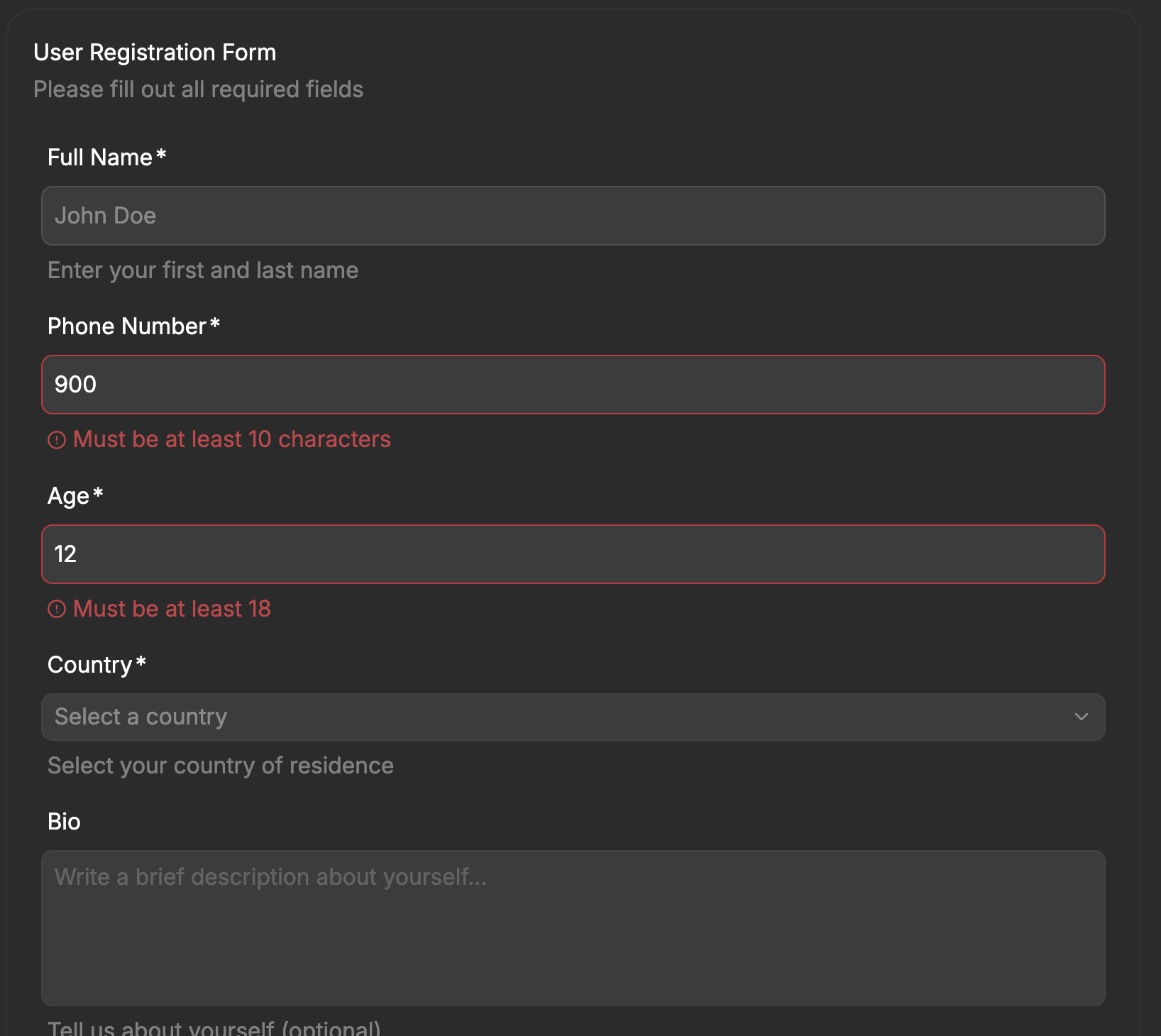
 * **Form validations** - Generated forms can optionally have validation rules applied to them.
 * **Improved Error Handling** - SDK now allows passing an `onError` prop to the `C1Component` to handle errors.
```tsx {3-5} [expandable] theme={null}
import { C1Component } from "@thesysai/genui-sdk";
...
{
console.error(`Generated UI error: ${code}, ${c1Response}`);
}} />
```
## Bug Fixes / Improvements
* Improved carousel responsiveness to adjust for different screen sizes.
Deprecation Notice: From this version onwards Anthropic Sonnet 3.5 and Sonnet 3.7 will not be supported since Anthropic has announced EOL for these models and actively suggests using Sonnet 4 instead.
***
Model versions:
* `c1/anthropic/claude-sonnet-4/v-20250815`
* `c1/anthropic/claude-3.7-sonnet/v-20250815`
* `c1/anthropic/claude-3.5-sonnet/v-20250815`
## UI
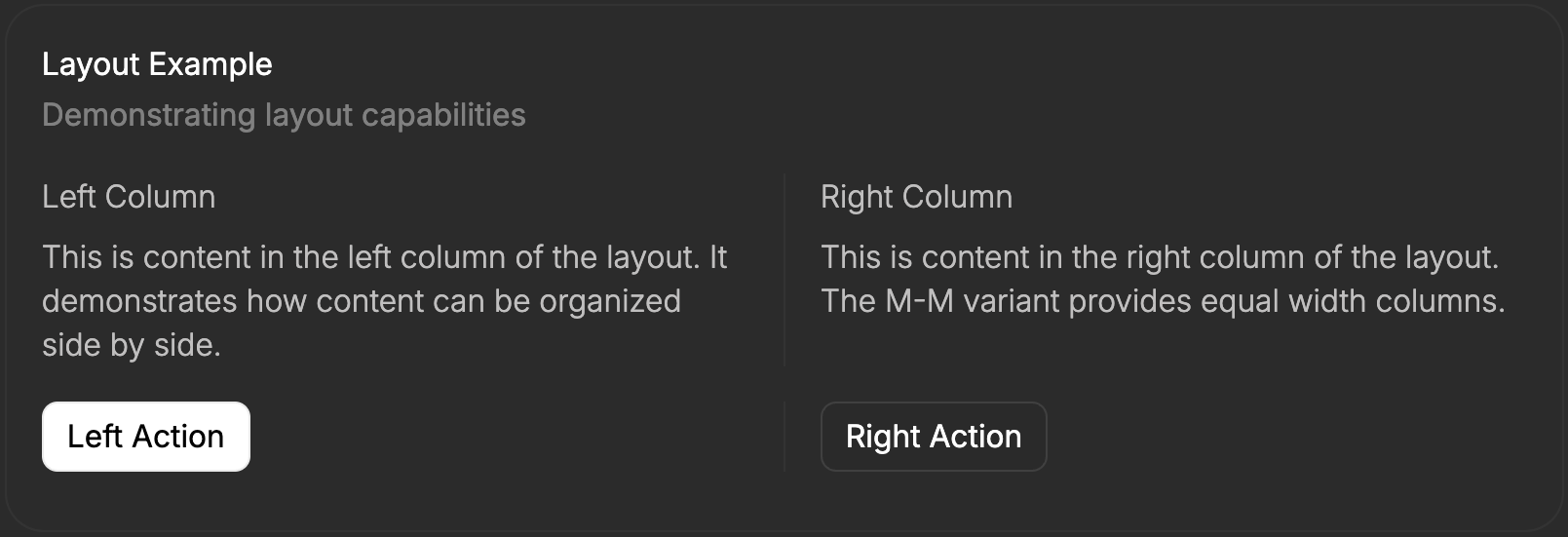
* Added support for advance layouting options
* **Improved Error Handling** - SDK now allows passing an `onError` prop to the `C1Component` to handle errors.
```tsx {3-5} [expandable] theme={null}
import { C1Component } from "@thesysai/genui-sdk";
...
{
console.error(`Generated UI error: ${code}, ${c1Response}`);
}} />
```
## Bug Fixes / Improvements
* Improved carousel responsiveness to adjust for different screen sizes.
Deprecation Notice: From this version onwards Anthropic Sonnet 3.5 and Sonnet 3.7 will not be supported since Anthropic has announced EOL for these models and actively suggests using Sonnet 4 instead.
***
Model versions:
* `c1/anthropic/claude-sonnet-4/v-20250815`
* `c1/anthropic/claude-3.7-sonnet/v-20250815`
* `c1/anthropic/claude-3.5-sonnet/v-20250815`
## UI
* Added support for advance layouting options
 * Added new mini-card component
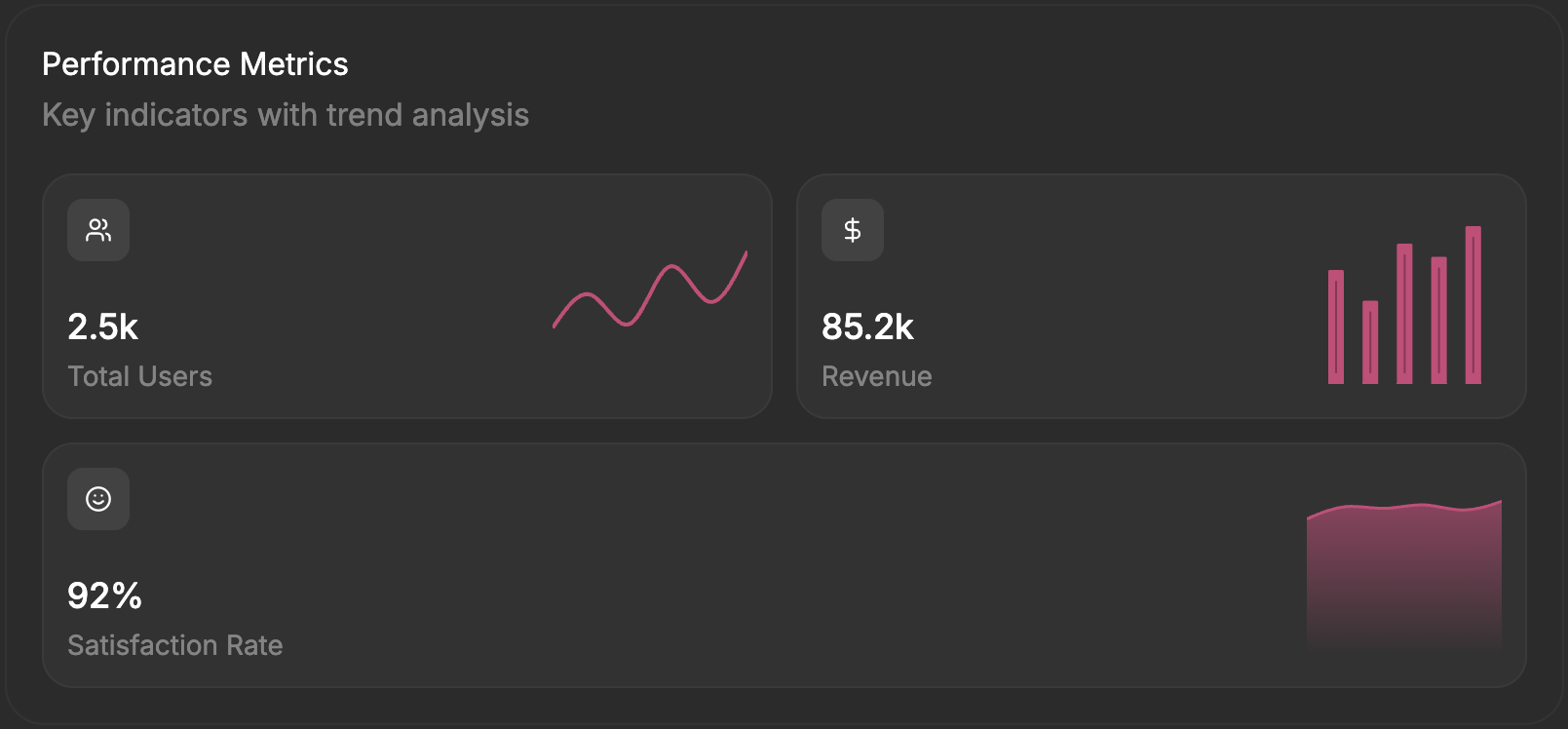 * Advanced layouting options can be disabled by using metadata. Pass `c1_excluded_components` in the metadata to exclude the component. This might be useful
if you are building a copilot or width-constrained agent.
```ts focus={3-7} theme={null}
const runToolResponse = openAIClient.chat.completions.runTools({
// ... other options
metadata: {
thesys: JSON.stringify({
c1_excluded_components: ["Layout"],
}),
},
});
```
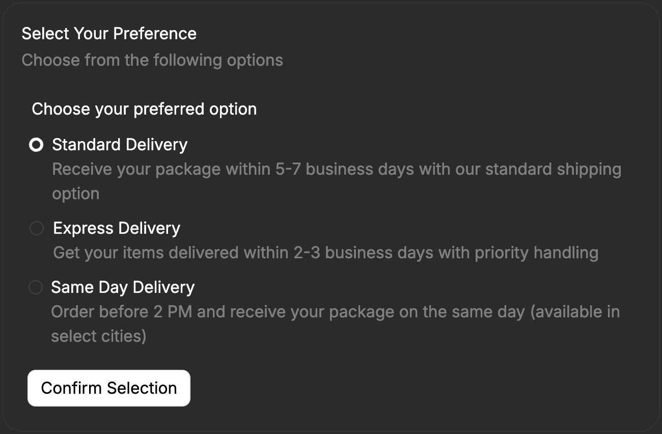
* Added optional description for switch, radio and checkbox components - this is helpful for explaining each option to the user before they make a choice.
* Advanced layouting options can be disabled by using metadata. Pass `c1_excluded_components` in the metadata to exclude the component. This might be useful
if you are building a copilot or width-constrained agent.
```ts focus={3-7} theme={null}
const runToolResponse = openAIClient.chat.completions.runTools({
// ... other options
metadata: {
thesys: JSON.stringify({
c1_excluded_components: ["Layout"],
}),
},
});
```
* Added optional description for switch, radio and checkbox components - this is helpful for explaining each option to the user before they make a choice.
 ## Bug Fixes / Improvements
* Fixed a bug where carousels appeared visually cluttered.
***
***
Model versions:
* `c1/anthropic/claude-3.5-sonnet/v-20250709`
* Added new 'Section' and 'Horizontal Stacked Bar Chart' components
* Updated graph schema to significantly reduce token usage
* Various fixes:
* Improved KaTeX rendering in markdown
* Fixed chart issues with negative and very large numbers
* Corrected Y-axis label display in charts
* Fixed datepicker value saving and submission
***
## Bug Fixes / Improvements
* Fixed a bug where carousels appeared visually cluttered.
***
***
Model versions:
* `c1/anthropic/claude-3.5-sonnet/v-20250709`
* Added new 'Section' and 'Horizontal Stacked Bar Chart' components
* Updated graph schema to significantly reduce token usage
* Various fixes:
* Improved KaTeX rendering in markdown
* Fixed chart issues with negative and very large numbers
* Corrected Y-axis label display in charts
* Fixed datepicker value saving and submission
***