<ThemeProvider>. This allows you to define palettes that are consistent with your brand and that can automatically adapt to light and dark modes.
The Chart Palette System
Chart styling uses a simple override system. You can set a default color palette for all charts and then, if needed, provide specific palettes for individual chart types.The Global Fallback: defaultChartPalette
The defaultChartPalette is the fastest way to apply a consistent color scheme. The array of colors you provide will be used for all chart types that do not have a more specific palette defined.
Specific Overrides: barChartPalette, lineChartPalette
For more detailed control, you can define a unique color palette for each chart type. A specific palette, like barChartPalette, will always be used instead of the defaultChartPalette for that chart type.
This example sets a default for all charts but provides a unique color set just for bar charts.
Available palette keys
Applying Palettes with Light and Dark Modes
You can define different chart palettes for yourtheme and darkTheme objects. This is useful for creating separate light and high contrast dark theme.
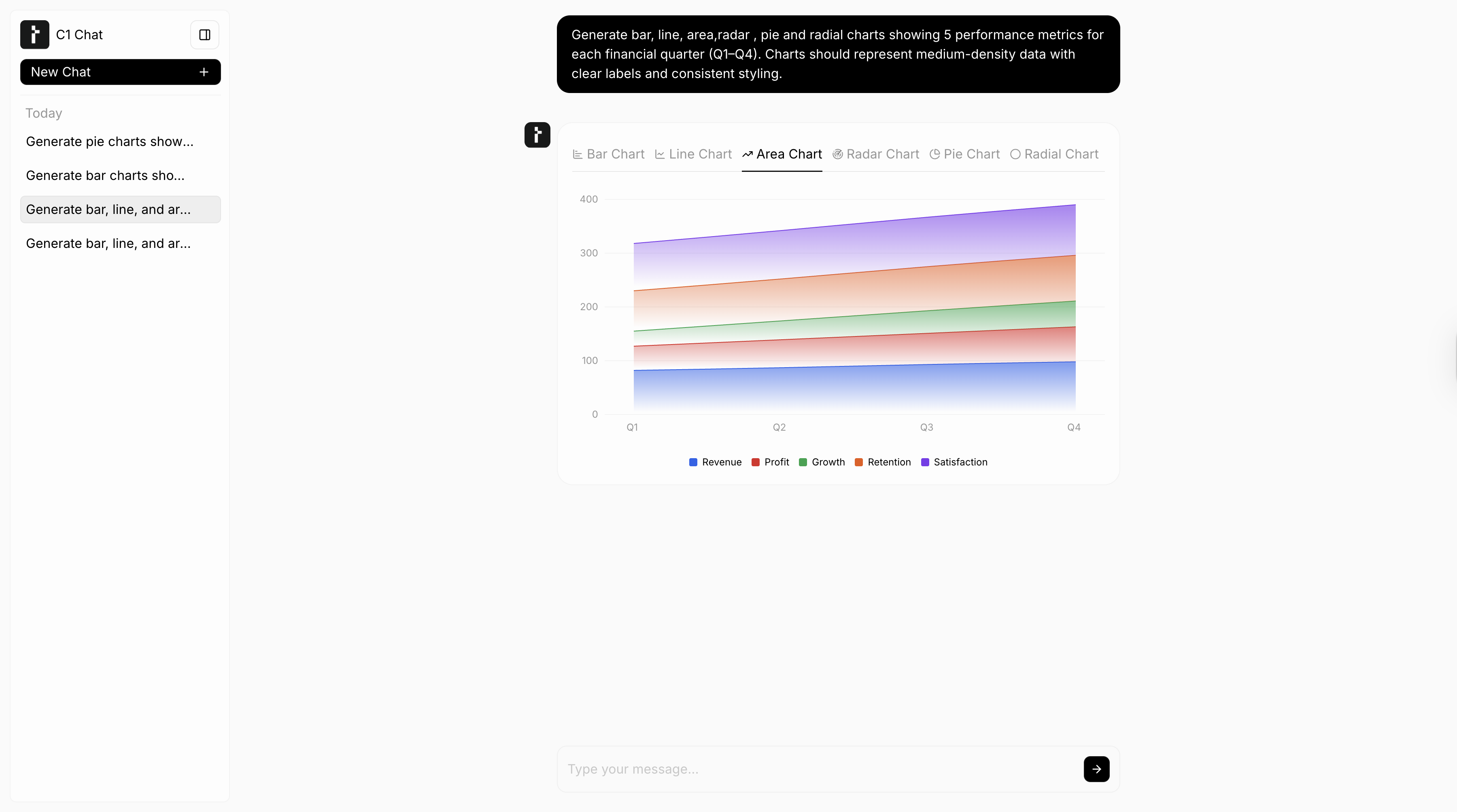
- Light Theme
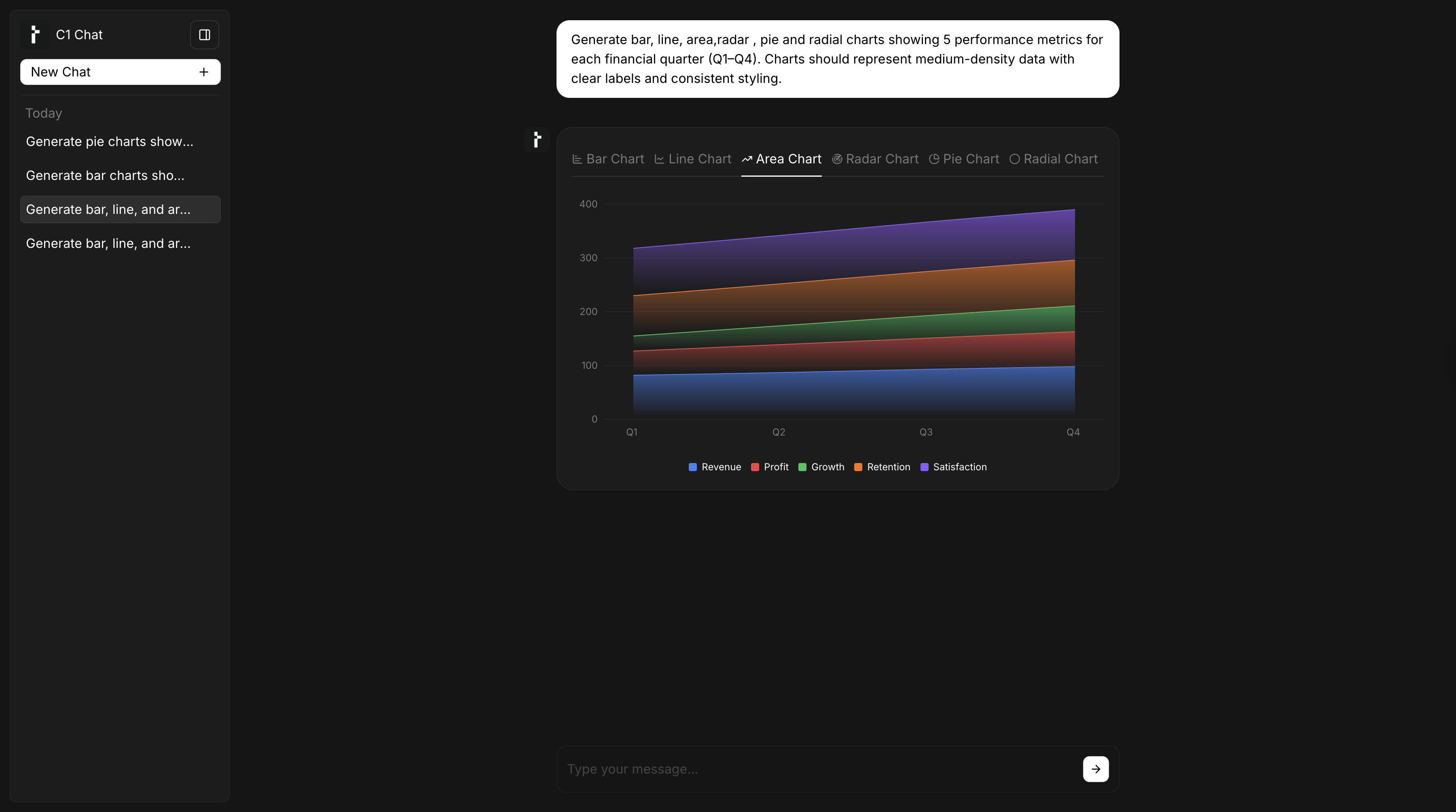
- Dark Theme