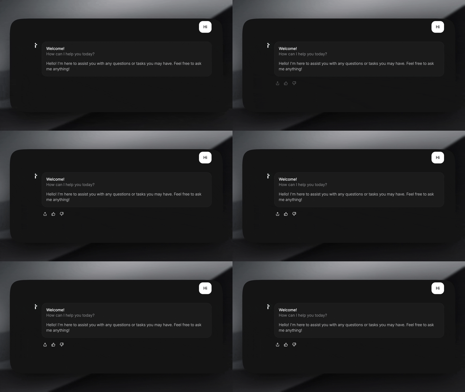
A response footer is a component that can be displayed at the bottom of a response after it has finished streaming. This is useful for adding actions like regenerating a response, copying the content to the clipboard, or providing feedback (thumbs up/down). TheDocumentation Index
Fetch the complete documentation index at: https://docs.thesys.dev/llms.txt
Use this file to discover all available pages before exploring further.
@thesysai/genui-sdk package provides a way to add a response footer via the C1Chat component. You can use the pre-built components that come with the SDK for common actions.
Here’s how to add a response footer using the pre-built components:
Create a response footer component
The SDK provides a set of pre-built components that you can use to quickly create a response footer. These components are available under the The
ResponseFooter export.First, create a new component that will wrap your footer elements. This component must be of type ResponseFooterComponent, which will provide it with threadId and messageId props. Then, use ResponseFooter.Container as a wrapper and add the desired buttons inside it.Here’s an example of how to use the pre-built ShareButton, ThumbsUpButton, and ThumbsDownButton:FooterComponent.tsx
ResponseFooterComponent receives messageId and threadId, which you can use in your click handlers and backend API calls.Pass the custom component to C1Chat
Next, pass your
FooterComponent to the C1Chat component via the customizeC1 prop.Customize the pre-built components (optional)
The pre-built
This is a simple container component that you can use to wrap your footer buttons. It provides basic styling and layout. It accepts
Both buttons use Crayon’s
ResponseFooter components accept props to customize their behavior.ResponseFooter.Container
This is a simple container component that you can use to wrap your footer buttons. It provides basic styling and layout. It accepts className and animate props.Whether to animate the footer when it is shown.
Takes class names as a string to modify the default styling.
ResponseFooter.ShareButton
A function that is called when the “Generate Link” button is clicked in the
share modal. It receives the full
message object and should return a promise
that resolves to a shareable URL. The button handles the UI for copying the
link to the clipboard and shows a confirmation.ResponseFooter.ThumbsUpButton & ResponseFooter.ThumbsDownButton
Both buttons use Crayon’s IconButton component with tertiary as the default variant. For details on all the props that they accept, refer to Crayon’s
IconButton documentation.